Choosing New Covers
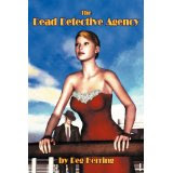
I asked the original publisher of the Dead Detective Mysteries to give me back the rights to the books. They were very nice about it, and I began the process of re-publishing them. Since audiences are often interested in how book covers come about, I thought I'd share my experiences with this series. When publishers accept a manuscript, they often ask the writer for her ideas on what the cover should look like. There is NO guarantee they'll listen, and other writers I've spoken with had covers they hated or felt didn't represent their books at all, but they were stuck with them. When asked about a cover for Book #1, I said I pictured a girl on a ship with a mysterious man in the background. My publisher's cover artist chose this as the cover for The Dead Detective Agency. Some people liked it; some didn't. A couple said the girl looked like my daughter; others said she looked like a robot. My first reaction was disappointment, but I recognize that I am NO ju